Want to supercharge your content and increase email subscribers?
To explore advanced techniques for improving blog content, collecting more email addresses, and promoting products and events, I interview Darren Rowse.
More About This Show
The Social Media Marketing podcast is an on-demand talk radio show from Social Media Examiner. It’s designed to help busy marketers and business owners discover what works with social media marketing.
In this episode, I interview Darren Rowse, one of the world’s leading experts on blogging. He’s the founder of two popular blogs: Digital Photography School and ProBlogger. He also co-authored the book ProBlogger and hosts the ProBlogger podcast.
Darren shares how he learned to better serve the needs of his readers.
You’ll discover how Darren uses portal pages and what goes into creating them.

Advanced Blogging: How to Make Your Blog Serve Your Business featuring insights from Darren Rowse on the Social Media Marketing Podcast.
Share your feedback, read the show notes, and get the links mentioned in this episode below.
Listen Now
Listen now: Play in new window | Download
Here are some of the things you’ll discover in this show:
Advanced Blogging
Determine What Type of Content to Create
Darren started by writing what he was excited about in the moment, and he believes that’s a great place for bloggers to start because their writing comes across as passionate. However, for bloggers to build expertise in a niche, he notes, they need to put more thought into it. Darren says there are two parts to achieving that outcome.
First, you need to understand the people who read your blog and what their needs are. Ultimately, Darren’s content ideas come from the conversations he has with readers; this determines what he writes about.
Second, you should develop before and after avatars. The before avatar represents who his readers are when they come to the blog, and the after avatar represents who he wants his readers to become. Use your avatars to fill in what your readers need to move from the before avatar to the after avatar, he explains.
For example, readers first come to the Digital Photography School blog because they don’t know how to use their cameras to full potential. The “after” readers have full creative control of their cameras, along with the confidence, knowledge, and technical skills to get out of automatic mode and take their photography to the next level. Give them what they want and sell them what they need.
For example, readers who come to Darren’s blog to get photography tips realize they need more help when they return from vacation and discover their photos didn’t reflect their journey. His ebook, A Guide to Captivating Travel Photography: Transcending Travel, delivers the things they didn’t realize they didn’t know, such as tips to help lift their photos.
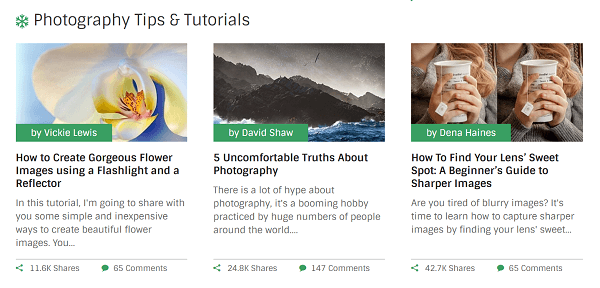
Digital Photography School teaches readers how to use their amazing cameras.
Darren used this exercise for the first time in 2006, and came up with 200 things his blog readers needed to know. Those notations became the first 200 posts on the site.
Listen to the show to discover how Darren uses what he knows about what people need to collect email subscribers, attract Facebook fans, sell products, and more.
Develop an Editorial Strategy
Darren shares the nine different elements he and his team work through each year to figure out their editorial strategy.
- Voice: Is your content more conversational, teaching, or storytelling?
- Evergreen vs. Time-sensitive Content: What’s the proper ratio? Darren’s photography blog leans more toward evergreen, but he notes others may need to create more time-sensitive content.
- Intent: Is your aim to inform, inspire, educate, or interact? Darren’s blogs focus on information and education, but mix in inspirational and interactive content here and there. As an example of content created to drive interaction, Darren says Digital Photography School does a challenge post each week in which they prompt readers to take photos using a specific technique and then share the photos in the comments.
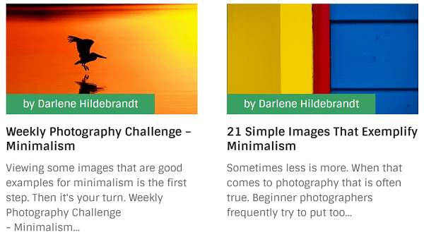
Digital Photography School has challenge posts in their content mix.
- Format: What type of content will you publish? Darren explains that he intentionally creates a mix of reviews, editorials, opinion pieces, news, and case studies. After recently completing this process with ProBlogger, he realized they hadn’t published enough case studies for a while. Now they have a goal to do a case study every other week.
- Authorship: Are you a single or multiple author blog? If you have multiple authors, do you have a high number of random guest posts or a regular writing team? That’s something Darren says has changed on his blogs over the years. He started by writing everything himself, moved to many guest posts, and now publishes posts authored by subject-matter experts.
- Frequency: Will you publish daily, weekly, or monthly? Again, this has changed for Darren over time. ProBlogger went from publishing twice a day to once a day, and recently moved to five posts a week.
- Content Length: Will your posts be short or long?
- Stand-alone vs. Series Posts: Will you publish one-off stand-alone posts or focus a series of posts on a single topic? For example, on his podcast, Darren did a seven-day challenge series on finding a blogging groove. ProBlogger recently published a week of posts on content creation: a case-study post, an interview post, and a couple of tutorials. While this approach let them cover a big topic, Darren cautions it could frustrate readers who aren’t interested in that week’s topic.

Series posts are one way to engage viewers on a particular topic.
- Matrix: You essentially have four types of content to consider here: written, video (live or recorded), audio, or visual. Darren says ProBlogger intentionally delivers mainly written content, but also has a regular podcast.
Listen to the show to hear how interactive content has changed.
About Portals
On most blogs, the last thing posted is the first thing readers see. If new readers happen to see something that’s good on the front page, that’s great. Yet that’s not often the case. ProBlogger, for example, has 8000 pieces of content, 95% of which is evergreen. This is why they’ve been toying with how to get the right content in front of people at the right time.
If you scroll down the front page of ProBlogger, there’s a heading that says, “I need help to…”, and visitors can choose Start a Blog, Create Content, Find Readers, Build Community, Make Money Blogging, Be Productive, Understand Technology, and Get Work.
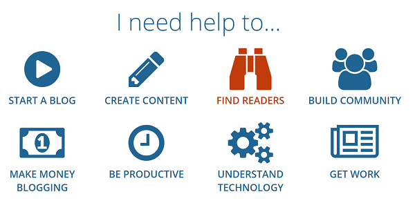
Using their portals, ProBlogger readers can easily find the content they want.
After users click on a topic, they’re sent to a portal that features a video of Darren. Darren talks about his own challenges in the area and how to use the page. While he plans to build an opt-in for each of the portal pages, currently there’s only one: Create Content.
Underneath the video, in the Start Here section, are six of the best posts on that topic, which cover beginner information and some of the frequently asked questions they’ve fielded. This is followed by the Latest section, which features recent content from the blog and podcast. Darren notes that users can play a podcast right from the page.
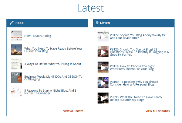
The latest content on a certain topic is in the middle of each portal.
Below the Start Here and Latest sections, there’s a product, offer, or other related recommendation. Each portal page is focused on getting people to content because that’s what will sell them on subscribing to the site.
Listen to the show to find out when Darren started experimenting with portals and hear about his initial findings.
Determining Portal Topics
Darren says determining the portals was more or less intuitive because he knows why people come to the site, what the most frequently asked questions are, and which content is most popular. Still, he made a point to survey readers to learn about their big challenges and main questions.
The site started with four portals: Create Content, Find New Readers, Build Community, and Make Money Blogging. Then Darren realized there was a massive amount of readers looking to start a blog, so Start a Blog became another portal. The last three portals grew from what he learned from survey responses.
Listen to the show to discover why the portal pages are so popular.
The Unique Home Page
Darren explains how they’re also designing their front page to function like a portal. One of the things they’re trying is using cookies to show different things to different people, depending on whether they’ve been to the site before.
Today, if someone comes to ProBlogger for the first time, they’ll see a page designed to create a good first impression. Under the words “Become a ProBlogger,” a quick history of the site includes links to their portals and the Start Here page. People can also subscribe from there.
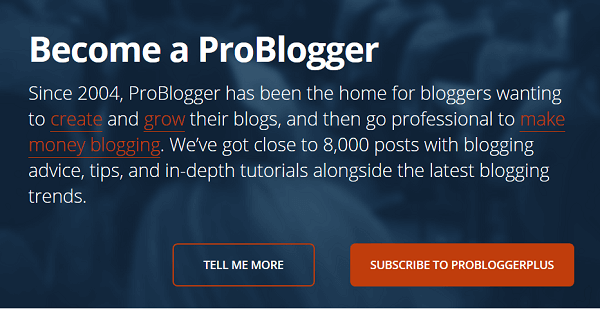
ProBlogger presents a customized start page for new visitors.
A returning visitor will see the words, “Welcome Back,” as well as the latest blog post and podcast. This page also asks, “Are you subscribed?”

Returning visitors are remembered on ProBlogger.
Listen to the show to learn how ProBlogger is able to give a different experience to new or returning visitors.
About Welcome Mats
Darren says when Digital Photography School started using pop-ups 10 years ago, signups to their newsletter increased. Darren was happy with that and says he got a bit complacent. Then he started seeing friends use welcome mats.
He says a welcome mat takes over the whole page and forces readers to hit “No Thanks,” close the mat, or subscribe. With a welcome mat, he says, they were typically seeing twice the conversions of a pop-up, and he’s since started using them on ProBlogger.
He believes a welcome mat is a little more elegant than a pop-up because the mat slides down the page.
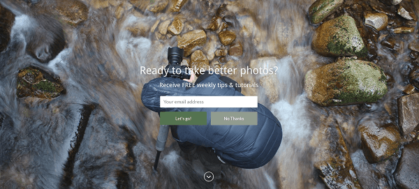
The welcome mat opt-in doubled Digital Photography School’s conversions.
He discusses several features of welcome mats, including the ability to add images and video to the slider, as well as configurations that will let you set them up to not show on certain pages or to only show to certain types of traffic visitors (like visitors who come from Google, Facebook, or Twitter).
You can choose to show one version to Facebook traffic and a different version to people who come from Twitter, show different offers to different audiences, or design a welcome mat for a particular post.
Darren shares that he uses both SumoMe and OptinMonster for welcome mats.
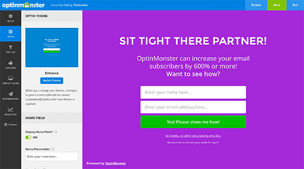
OptinMonster (shown) and SumoMe have great welcome mat options.
While welcome mats work on both mobile and desktop, Darren offers a word of warning. A few months ago, Google announced they’re going to start penalizing sites that interrupt the mobile experience. So in January Darren will stop using a welcome mat on his mobile sites.
Darren talks about the types of testing he’s done with welcome mats and suggests others test different type fonts, colors, and calls to action when experimenting with welcome mats on their own.
Listen to the show to hear the reaction of Darren’s audience to the welcome mat.
Discovery of the Week
Patch, a smart portrait editing app for iOS, automatically edits your images and simulates a blurred background effect that lets the subject of your photo stand out.

The Patch app blurs the background on your mobile photos, which makes them look a lot better.
Open up an image inside the app, turn up the intensity, and in 10 seconds the image is processed from a cell phone selfie into something worthy of framing.
You can use images from the built-in camera on your phone, uploaded images, or imported photos from your camera roll. So if you’re at a conference and take a bunch of awesome selfies, you can process them afterward!
Patch is free in the App Store but offers watermark removal for a 99 cent fee.
Listen to the show to learn more and let us know how Patch works for you.
Listen to the show!
Key takeaways mentioned in this episode:
- Learn more about Darren on ProBlogger and Digital Photography School.
- Listen to ProBlogger podcast.
- Read ProBlogger.
- Check out the travel photography ebook.
- Read Digital Photography School’s tips and tutorials, as well as examples of a challenge and discussion post.
- Listen to the first podcast in ProBlogger’s blogging groove series.
- Check out the Create Content portal and get a free download with blog post ideas.
- Read ProBlogger’s Start Here page.
- Learn more about welcome mats on SumoMe and OptinMonster.
- Get information on Google’s announcement about penalizing sites that interrupt the mobile experience.
- Check out Patch.
- Watch our weekly Social Media Marketing Talk Show on Fridays at 8 AM Pacific on Huzza.io, or tune in on Facebook Live.
- Learn more about Social Media Marketing World 2017.


No comments:
Post a Comment