Do you have the new LinkedIn experience?
Wondering what’s changed?
LinkedIn has made it easier to find new contacts, interact with connections, and write posts.
In this article, you’ll discover how to navigate the new LinkedIn and where to find what you need.
LinkedIn Changes: What Marketers Need to Know by Viveka von Rosen on Social Media Examiner.
#1: Explore the Home Page
When you sign into LinkedIn on desktop, you’ll immediately notice the cleaner look of the home page. The menu bar is thinner and deep teal, and the icons are the same as those on the LinkedIn mobile app.
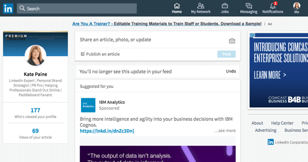
This is the redesigned LinkedIn home page on desktop.
On the left, you’ll see a snapshot of your profile with your picture, professional headline, the number of people who have viewed your profile, and views of recent articles. It’s nearly identical to the mobile app’s Me section.
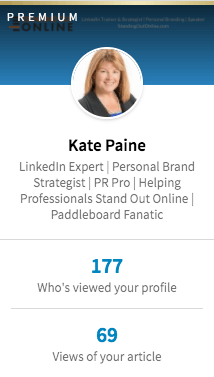
View a snapshot of your LinkedIn profile when you log into the newest version of LinkedIn.
There’s a slight difference in the content sharing section, which is in the center of the home page. You have the option to share an article, photo, or update. Below that is a link to create an article, which is the same as publishing a long-form post on LinkedIn Publisher.

Share content or publish an article right from your LinkedIn profile.
Your LinkedIn feed or timeline appears next and looks pretty much the same as it did before the update.
#2: Tour the Me Section
As in the LinkedIn mobile app, what used to be the Profile section is now called Me. Click the Me icon to view and edit your profile, adjust privacy and settings, access the help center, change the language of your profile, upgrade to a premium account, and sign out.
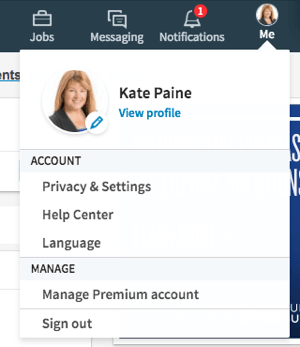
Click the Me icon to edit your profile and privacy settings.
Notice that your background photo size has changed in the new design. The new recommended size for the background photo is 1536 x 768 pixels. Take a few minutes and create a background photo in line with the new specs.
Your profile photo is now circular and appears front and center in the intro section. This is the same as in the mobile app.
To edit the intro section, click the pen icon. Make changes to your first name, last name, current position, education, country and zip code, industry, professional headline, Summary section, and the media you want to add to your summary. When people view your profile, they’ll see only the first two lines of your Summary section, so make them stand out.
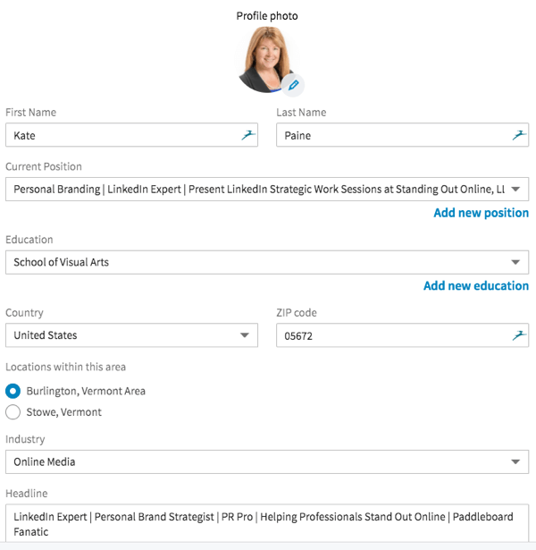
The new LinkedIn interface makes it easy to update information in your LinkedIn intro section.
Also, your contact info shows up on the right-hand side when someone views your profile.
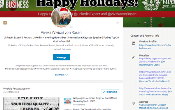
Contact information and links show up to the right of your LinkedIn profile when someone views it.
Notice that the customized web links formerly on your profile have been replaced with just a URL. Your description appears in parentheses right after the link.
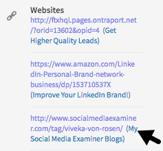
While you can no longer customize your LinkedIn profile links, you can include descriptions next to them.
Under the Me (or intro) section, you can see who’s viewed your profile and articles.
Beneath that, you’ll see recommendations to strengthen your profile. LinkedIn might suggest skills or sections to add to your profile, such as experience and education. This used to appear at the top of your profile. Now it’s in a less obtrusive position.
The rest of the profile is similar to the previous version. You still have the Experience, Education, Volunteer Experience and Causes, Skills, Endorsements, and Recommendations sections. The main difference is that you can no longer change the order of these sections.
There’s also a new section called Accomplishments, where you can add projects, courses, publications, certifications, honors and awards, and patents.
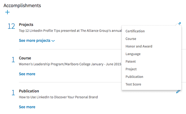
Add accomplishments to your LinkedIn profile in this new section.
You can add new profile sections two ways: from the right sidebar or within the profile itself.
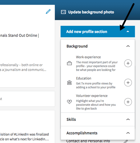
Add a new section from your LinkedIn profile or the right sidebar.
At the end of the Me section, you’ll see the people and companies you follow.
#3: Get to Know Search
The biggest change on LinkedIn is in search. The new user interface doesn’t have the advanced search options, so you can no longer filter searches by keyword, first and last name, title, and location.
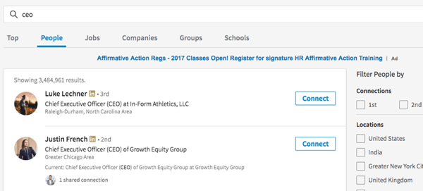
LinkedIn has changed the search functionality in the new design.
However, you can still filter by the level of connections (first, second, or third), general locations (but not zip codes), companies, industries, profile language, non-profit, language, and schools. From the search page, you can also seek out jobs, companies, groups, and schools.
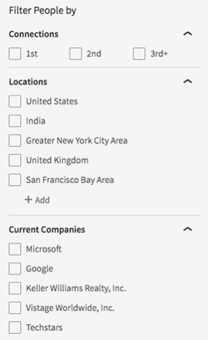
Search options are limited in the updated free version of the LinkedIn user interface.
You can use Boolean search, but it’s not as effective as it was when it was combined with advanced search before. I tested identical Boolean searches in the old and new interfaces, and the results differed significantly.
Two other features, saved searches and tagging, are no longer available for free. However, LinkedIn’s premium option, Sales Solutions’ Sales Navigator, allows for saved and advanced searches, and tagging. LinkedIn is currently offering three months of free access to Sales Navigator to people who haven’t used it before.
#4: Examine My Network
There are some noteworthy changes in My Network, as well.
I like the clean new look of this section, which allows you to see your invitations and people you may know, as well as click into those profiles. However, when you click on your connections, the only options now are to message them or remove them.
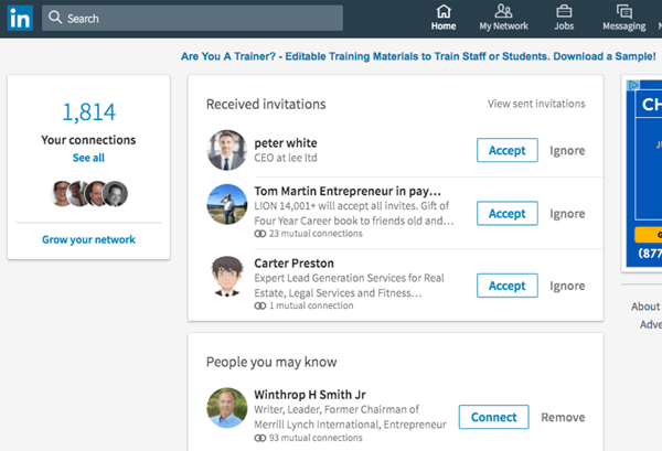
The new My Network interface lets you accept, connect, message, or remove connections from the page.
In My Network, you can sort only by recently added, first name, and last name. LinkedIn has removed all other sorting features and tags.
#5: Look at More Options
Interests has reverted back to More, and it’s the same icon as in the mobile app. You can access LinkedIn Learning, Post a Job, Groups, ProFinder, Lookup, and SlideShare, as well as upgrade to Talent Solutions or Sales Solutions. This is also where you can create a company page.
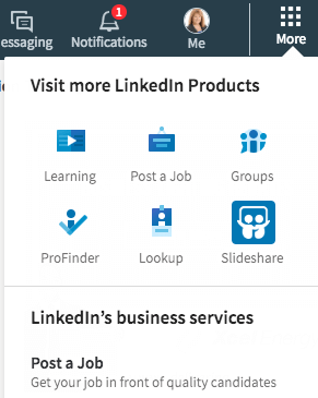
You’ll find lots of direct links in LinkedIn’s More section. You can also create a company page from here.
One of the things I like about the new More feature is that you can access ProFinder, Lookup, and SlideShare in just one click. Previously, you needed to search to find them.
#6: Check Out Notifications
Notifications get their own section in the new LinkedIn user interface, which makes it much easier to view interactions and respond.
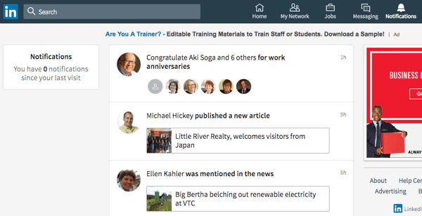
Easily review and respond to LinkedIn notifications, which are now in their own section.
The Notifications section also lets you view work anniversaries, people in your network who published an article or have been mentioned in the news, birthdays, and promotions. You’ll also see people who have followed you, engaged with your articles and other content, and endorsed you.
In Conclusion
LinkedIn wants users to have a more cohesive experience between the mobile app and the desktop browser, which is what this update accomplishes.
Although a lot has changed, it seems the Messaging, Jobs, and Ads features have remained the same in the new user interface. Yes, some features, such as certain search functions and tagging, may be missing from the free version of LinkedIn. However, most marketers will find the new user interface more intuitive.
What do you think? Have you received access to the new LinkedIn user interface? Do you like it? Please share your thoughts in the comments.

No comments:
Post a Comment