

In fact, when it comes to web design, it's a best practice to give your content a little breathing room.
Today's website visitors are content-scanners. They scroll quickly, skim posts, and get distracted by busy layouts trying to accomplish too much. The key to getting your visitors' undivided attention is simplicity -- and that starts with an effective use of whitespace.
In this article, we'll take a brief look at why whitespace matters, what it means for conversion-driven web design, and how eight websites are using whitespace to lead their visitors towards a desired action.
What Is Whitespace?
Whitespace refers to the negative areas in any composition. It's the unmarked distance between different elements that gives viewers some visual breaks when they process design, minimizing distractions and making it easier to focus.
Intentionally blank areas aren't just aesthetically pleasing -- they actually have a big impact on how our brains take in and process new material. Too much information or visual data crammed into a small, busy space can cause cognitive fatigue, and our brains have difficulty absorbing anything at all. It's information overload at its very worst.
Why We Need Whitespace
To understand the importance of whitespace, think about how difficult it is for your brain to process an entire page from the phone book or white pages. All those columns of teeny tiny text get squished together into one indigestible chunk of information, and it can be a real challenge to find what you're looking for.
While phone books are designed to display maximum information in minimum space, the majority of print layouts are created to be more easily understood -- thanks to whitespace.
To illustrate how effective whitespace is at helping our brains process information in print, check out the example below from Digital Ink:
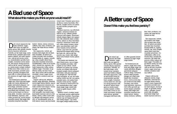
See the difference? The layout on the left uses the vast majority of available space, but it looks crowded and severe -- not exactly something you'd feel comfortable staring at for a long time to read.
In contrast, the layout on the right uses wider columns and more distance between paragraphs. It's a simple design shift that has a major impact on making the article look more approachable and readable.
In addition to making layouts easier to understand, whitespace can also place emphasis on specific elements, helping the viewer understand what they should focus on. Using whitespace to break up a layout and group particular things together helps create a sense of balance and sophistication.
Take a look at this business card example from Printwand:
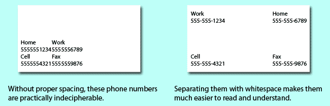
The business card on the left does include negative space, but the elements are still cramped into one area, making the whole card look cluttered and unprofessional. The card on the right uses whitespace to a better effect, spacing the individual elements out so the composition is easier to make sense of.
When it comes to designing websites, whitespace is crucial -- not only from an aesthetic standpoint, but also from a conversion optimization perspective. Using whitespace effectively can make your website more easily navigable, comprehensible, and conversion-friendly, directing users more smoothly to call-to-actions and encouraging them to convert.
In fact, research by Human Factors International found that using whitespace to highlight or emphasize important elements on a website increased visitor comprehension by almost 20%.
Just take a look at these two website layouts:
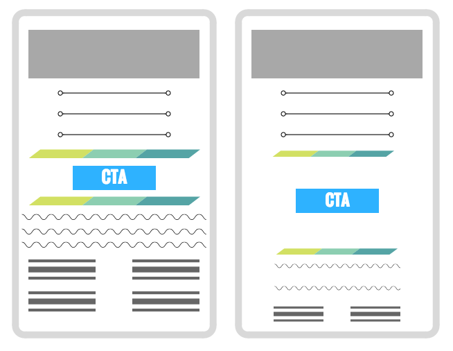
On the left, the call-to-action button has no room to breathe -- it's wedged between busy dividers and tightly packed text. There's too much distraction around the button, making it difficult for visitors to focus on what matters.
On the right, the call-to-action has been padded with some much-needed whitespace. The button now appears to be a focal point on the page, encouraging visitors to stop and take notice.
You'll notice that adding some whitespace around our call-to-action has caused some of the other content on the page to be pushed down -- and that's perfectly okay. Not everything has to be above the fold (the part of the website that appears before the user starts to scroll). In fact, designers shouldn't try to stuff a ton of content before the fold of the page, since it will end up looking cluttered and overwhelming.
8 Websites Using Whitespace to Their Advantage
1) Shopify
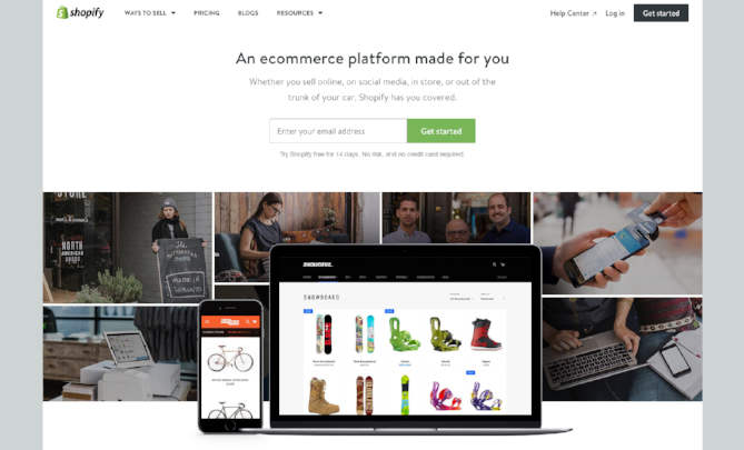
The homepage for ecommerce platform Shopify has a simple objective: Get visitors to sign up for a free trial.
To direct users to this action, they've surrounded their one-field sign-up form with plenty of whitespace, minimizing distractions and ensuring visitors can't miss it. The site's main navigation is displayed much smaller than the form text, and placed out of the way at the top of the screen to avoid taking attention away from the central form.
2) Everlane
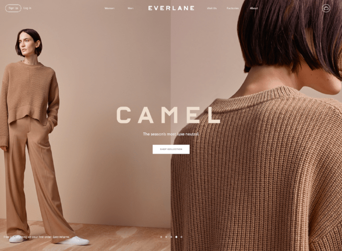
Whitespace doesn't have to mean the complete absence of color or pictures -- it means making sure page elements are generously and strategically spaced to avoid overwhelming or confusing your visitors.
To show off their latest clothing collection, fashion retailer Everlane opts for a minimal set up: The full page background shows off a photograph of their "Camel" collection, and a small, expertly placed call-to-action appears in the center of the screen, encouraging users to click and "shop collection." It's a perfect example of leading users towards an action without being pushy or aggressive.
3) Airbnb
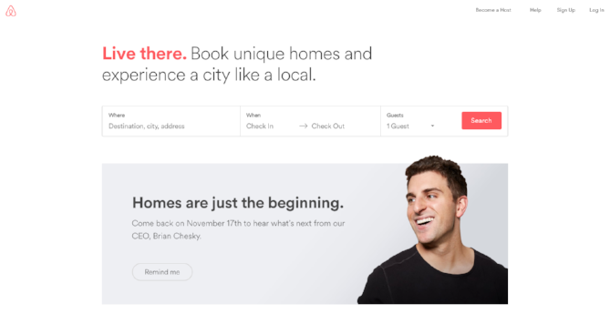
There are a lot of potential visuals that room share company Airbnb could have included on their homepage, but instead, they went with this straightforward, conversion-friendly design that leads visitors to try their product immediately.
The minimal layout relies on very limited copy and visuals, placing all the emphasis on the search box. The succinct copy invites users to try searching for a room, and the navigation and logo are tucked out of the way in the corners of the page.
4) Wistia
Using whitespace strategically can be as easy as making sure your forms and call-to-action buttons are noticeably separated from the rest of your content. This simple change makes a huge difference in how your content is perceived.
Wistia, a video platform, anchors their homepage with a friendly question and a drop-down form. The form serves as the central focal point of the whole page, and it's given plenty of space to set it apart from the site's main navigation and image.

5) Welikesmall
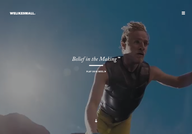
Digital agency Welikesmall proves that whitespace doesn't have to be boring, empty, or even static. Their homepage displays a full screen demo reel of their recent video projects, filtering through a variety of exciting vignettes to immediately capture the visitor's attention.
Full-screen video in any other context could seem busy and aggressive, but since the layout is designed with generous whitespace, it looks polished. With all the focus on the video background, the text is kept minimal. The agency's logo appears in one corner, and a folded hamburger style menu appears in the other. Welikesmall's slogan -- "Belief in the Making" -- is fixed in the center of the screen, along with a call-to-action button linking to the agency's full 2016 demo reel.
6) Simpla
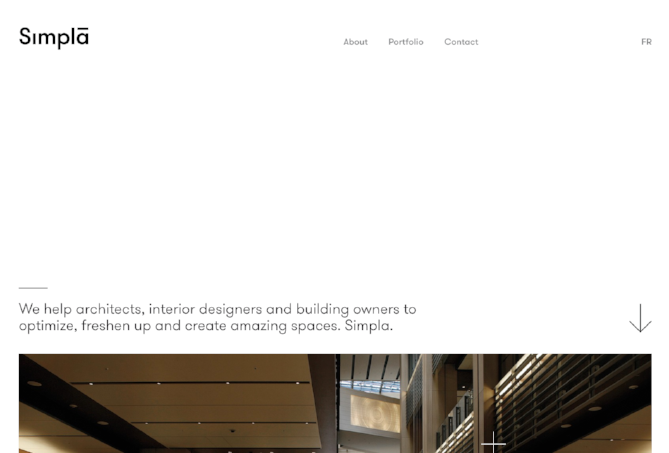
This homepage from Simpla demonstrates the power that a relatively empty above the fold section can have. This simple, decidedly minimal homepage uses whitespace to urge users to keep scrolling.
Beneath the logo and navigation, a large portion of the site has been left unmarked. The top of a photo -- along with a short paragraph of text and an arrow -- invites visitors to keep reading to learn more about the company and their mission.
This unique use of whitespace not only looks sophisticated, but it strategically draws visitors further into the site.
7) Harvard Art Museums
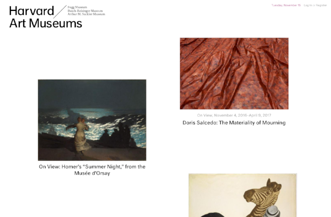
The Harvard Art Museums might be known for displaying antiquated paintings, but their homepage is decidedly modern. The whitespace here provides the perfect backdrop for the featured art, making sure that nothing distracts from the pieces themselves. It's about as close to a digital art exhibition as you can get.
The masonry-style layout gives the user a reason to keep scrolling, and also ensures that none of the images are crowded together. To maintain the minimal gallery aesthetic, the site's navigation is completely hidden until the user hovers their mouse towards the top of the page.
8) Burnkit
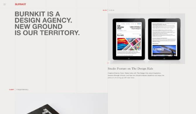
When working with whitespace on your homepage, you'll have to make some tough decisions about what's important enough to display, since there's less room for a pile of cluttered content. This design agency shows us that you can display a wide variety of content in a minimal layout, without squishing things together and muddling the composition.
Burnkit's homepage features blog content, key excerpts from the agency's portfolio of client work, and behind the scenes looks at the agency's culture. So how did they manage to fit so much onto one page without overwhelming the visitor? Whitespace. Lots and lots of whitespace. Each article is given generous padding, and the user can keep scrolling to reveal new material.
How does your website use whitespace? Let us know in the comments or tweet us

