People don’t like online forms. And it’s not hard to see why: Online forms require extra work (and time) and typically stand in the way of a consumer getting what he or she really wants—like a piece of content or access to software.
This is not great news for marketers, who are tasked with converting website visitors into customers through lead generation forms. Luckily, there are proven ways to reduce form friction and get prospects to hand over their valuable information.
Focus on Form Appearance
If you want to see results with your lead generation form, you have to focus on the initial attraction. Potential customers will fly past your form if it doesn’t stand out on the web page and force them to take a look.
When building an online form, you need to consider each of your form’s attention-grabbing elements, such as where it is placed on the page, what colors it uses, and how it is laid out.
In general, you should keep your form simple and avoid too many visual distractions (especially if you hope to convert mobile visitors). And you should use colors that invoke trust or motivate visitors to take action, such as blue, green, or orange.
Additionally, your submit button should be the stand-out element on the form. If you want to draw as many eyeballs and submissions as possible, the button should use a contrasting color and be big enough for visitors to click from any device.
Use Conditional Logic
Another way to enhance the overall form experience for users (and get more submissions) is through use of conditional logic. This functionality allows you to personalize the experience by keeping certain fields hidden unless they are relevant (based on users’ responses on previous fields).
For example, if you’re conducting a customer survey, you can use Conditional Logic to gather additional information if customer’s respond a certain way.
The general benefit of using Conditional Logic is twofold:
. It helps visitors avoid filling out irrelevant fields.
. It streamlines your form and keeps it looking lean.
Conditional Logic is also great for mobile users (since it can let them skip fields and get through a form quicker), and it has been proven to boost conversions by up to 50%.
Consider Form Fields & Order
Like anything, it doesn’t matter how pretty your form looks if it’s not built on a solid foundation. That means the fields you include on your form matter—a lot.
Lead generation forms are a great way to get to know your leads, but you don’t want to scare them away with too many unnecessary fields. Aim to include only those fields that are crucial to your campaign or marketing strategy.
For example, if you’re just looking for blog subscribers that you can nurture, you don’t need more than an email address field.
If you’re looking to gather high-quality leads, you’ll likely need more than a single field. In these cases, consider lowering the threat of submission by making certain fields optional. Or use your form to create a multi-step conversion process that puts low-friction or high-converting fields first.
Create an Effective CTA
The final building block of your lead generation form is the call to action (CTA). And the goal is always to seal the deal with a strong CTA.
But what makes a CTA strong?
For starters, your submit button often functions as your CTA, so it should specifically state what will happen when a user clicks (adding just one word to the CTA for clarity can lead to a 320% conversion lift!). Your CTA copy shouldn’t be too lengthy, though. Most of the best CTA buttons include just one or two words.
Additionally, your CTA should stand out from the rest of your form design to draw attention and encourage submissions. And if you have a form headline, it should reflect the overall benefit of filling out your form and clicking the CTA button.
Conduct Form A/B Tests
Once you’ve built your lead generation form, it’s a good idea to test it for optimal performance. Form A/B testing allows you to create higher-converting forms by testing two versions against one another to find out which resonates best with your audience.
You can learn a lot from form A/B tests. But it’s best to test just one element at time, starting with your headline or CTA copy, form length, and button colors. If one form in the test comes out as the clear winner, it’s a sure sign that you’ve improved an important element on your form.
Collecting and analyzing data on form performance will help you create the strongest lead generation form possible. While it’s good practice to follow known conversion rate optimization tips, testing is really the only way to find out what tweaks will boost conversions among your unique audience.
Use Partial Submissions and Bottlenecks
Another way to improve your form’s performance once you’ve done the heavy lifting is through form features like Partial Submissions and Field Bottlenecks. Both features allow you to see what is causing people to abandon your form so you can find and fix the problems. Additionally, Partial Submissions allows you to capture information from people who start filling out your form but don’t submit.
The ability to identify fields that cause frequent bottlenecks is highly valuable. With that type of deep insight, you can easily remove low-performing fields or make them optional to improve your form.
Real-time data captured from people who abandon your form after partial completion is also highly valuable. Gathering information from visitors who don’t convert gives you another chance to follow-up and capture the conversion.
Bonus infographic: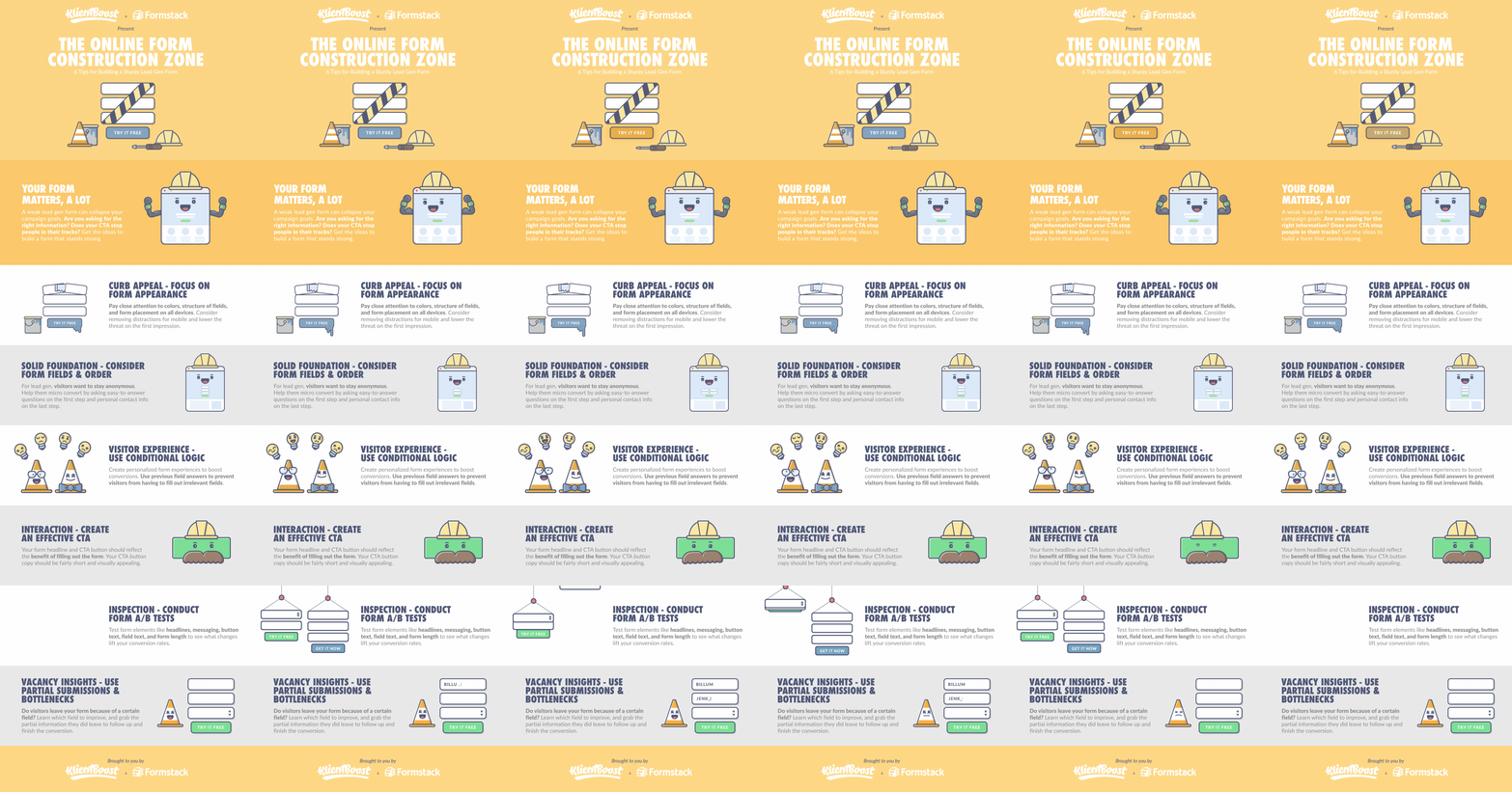
Keep Building!
A sturdy lead generation form isn’t built in a day...but following these conversion rate optimization tips can help you get there quicker.
After all, most people won’t tell you they don’t like your form; they’ll simply bounce away without a second look. So it’s up to you to put in the upfront work to attract and convert valuable passersby.

![53 Features Every Local Business Website Must Have [Infographic]](https://blogger.googleusercontent.com/img/b/R29vZ2xl/AVvXsEjYcjEj4odmHrjUOoPWpr8dXLdOV4WN5Xoum83evLbAU3FRcfk2H7cj9S1Lvu63vIZT2bT5212cFeZrbqmeV7oV9TUnKT2aLabjE8xZ2dg4c70sNniM85fHrfAfYcK7HpRAO1qSsF_g-O8b/s1600/website-features-local-business-infographic.png "53 Features Every Local Business Website Must Have")
![53 Essential Features Every Local Business Website Should Have [Infographic]](https://s-media-cache-ak0.pinimg.com/originals/37/e6/f4/37e6f41cf4472333f93d99fdfec2edd9.jpg)


![How To Perform A Better Keyword Research [infographic]](https://s-media-cache-ak0.pinimg.com/originals/c8/08/13/c80813fb9bef8ee848d959c557e4ae07.png)


