
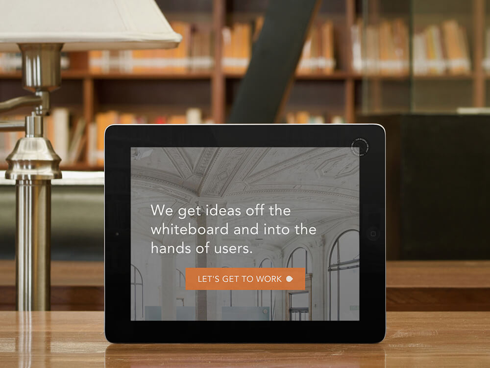
Goal: To create the world’s most effective landing page.
Problem: Where the heck do I start?
Crafting a competition-crushing landing page is not for the faint of heart. There are dozens of different components to keep in mind, a whole science of psychology lurking beneath the surface, and the vague idea of “what the customer wants” whispering in the background.
How can you demystify the process and unleash your landing page, to the amazement of the watching world?
Keep reading, and I’ll lay it out for you. But before I do, I want to assure you…
There is no standard manual on the creation of a perfect landing page.
Isn’t there some practical, step-by-step guide to putting together such a landing page? There are guides on how to build a real rocket. What about landing pages? Where is the easy, go-to guide?
You’re reading the closest thing to it.
Sadly, there’s no one-size-fits-all instruction book. No matter how hard you look, you’ll never find landing page Holy Grail. Why?
Landing pages have so many differentiating factors.
Landing pages are as different as the people looking at them. Every landing page has a different call to action (goal), a different reader (user), a different product or service, and a different niche.
- Some landing pages are selling zero drop shoes to ultramarathoners.
- Another landing page might be inviting in-house marketers to a two-day conversion conference in Toronto.
- Yet another landing page may be inviting sommeliers to take an online pairing quiz.
There is an incredible amount of variation among audience, purpose, intent, product, angle, focus, industry, niche, perception, buy-in, cost, messaging, value proposition, testimonial approach, shipping method, and a host of other factors.
One size does not fit all.
There are unifying elements that characterize highly successful landing pages.
Because we’re talking about landing pages, however, some things do remain constant. High-converting landing pages do have several characteristics in common. Although this article does not provide a full review of each element, you’ll know enough by the end to get to work creating your own compelling landing page.
Essential Element 1: Killer Headline
A headline is where everything begins — interest, attention, and understanding. The headline is your first and most critical action of a landing page. Here’s what it needs to accomplish:
- The headline should grab the reader’s attention.
- The headline should inform the user what the product or service is all about. Note: If your headline complements an image that explains the product/service, then you’re good.
- It should be short — never more than twenty words, and preferably only ten.
This landing page for a social skills course emphasizes the problem that the course solves. Immediately, readers know the problem that they will overcome.

Notice this headline from PictureMarketing. It makes no attempt to be clever, but identifies exactly what the service is intended to provide. Mission accomplished.

Monsoon uses a short, attention-grabbing headline, then immediately backs it up with a subheadline. This landing page’s clean design helps to give further power to the image and headline.

MailChimp uses a simple, declarative statement to democratize its product and emphasize its importance.

Essential Element 2: Persuasive Subheadline
If the headline makes the user look, then the subheadline should make them stay. A subhead is part of the one-two punch of a landing page’s power.
- Normally, the persuasive subheadline is positioned directly underneath the main headline.
- The subheadline should have some element of persuasiveness. Remember, you’re luring them to stay on the page with the subheadline. You take the concept of the headline, and push it a little bit further.
- The subheadline can go into slightly more depth and detail than the main headline.
HelpDesk’s landing page does a position flip on the headline and subheadline. In the image below, notice how the main headline is, “A delightful customer experience.” The subheadline, positioned smaller and above it focuses that general idea (customer experience) with this statement: “A help desk for teams that insist on.”
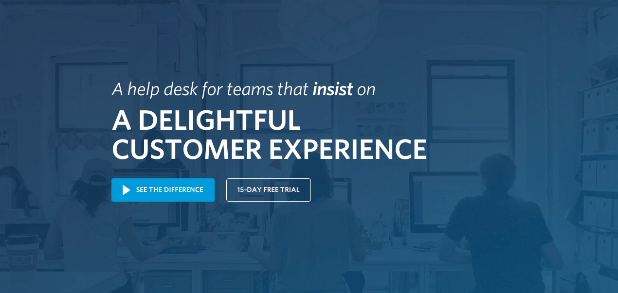
The position switch seems to be intentional. Taken together, it forms a whole sentence, but the attention should be first directed on that emotionally-loaded phrase: “delightful customer experience.”
Essential Element 3: Pictures
The brain processes images 60,000 times faster than text. A user will be affected by the images on your landing page immediately.
- The pictures should be large.
- The pictures should be relevant to your product or service. If you are selling a physical product, it is essential that your landing page contain an image of the product.
- If you are selling a service, then the primary purpose of the image should be to grab attention, and demonstrate relevance to the product.
- Make sure the pictures are high-quality. This is not the place to feature stock photographs or last-minute Photoshop botches.
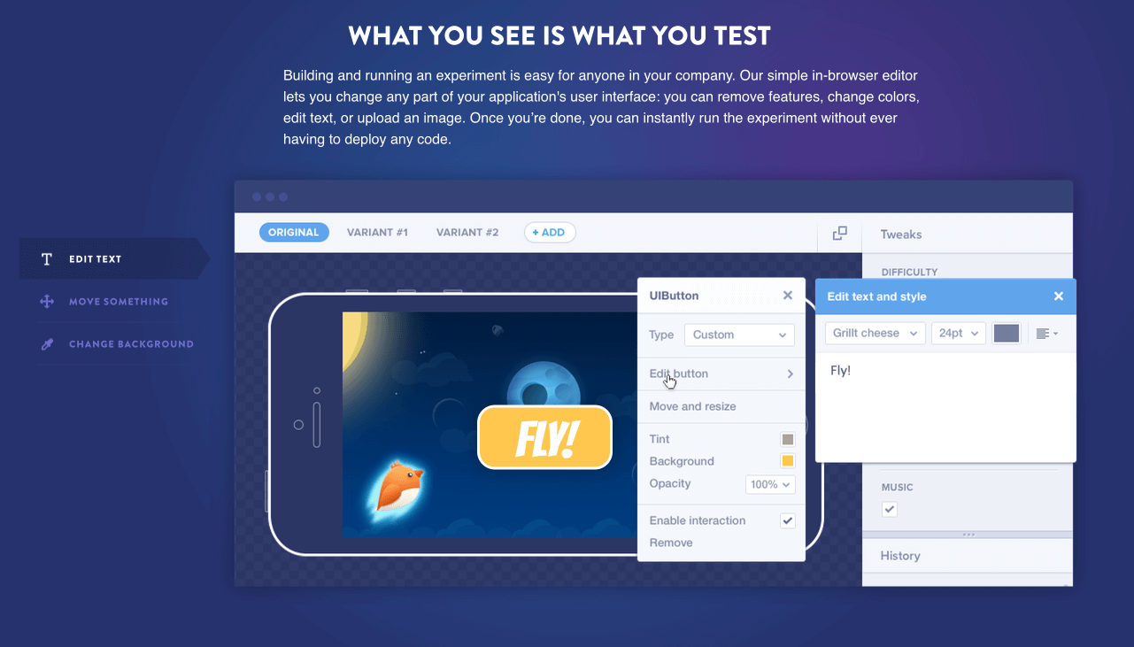
Mixpanel uses images to show the functionality of the product, and to help explain it. These images are fun, and attention-grabbing.
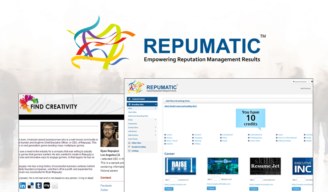
Repumatic’s landing page uses large screenshots to display the software’s functionality.
Shutterstock sells images, so it’s only natural that they would have a landing page with a large, prominent picture.

PictureU, whose service also includes photos, does a great job of featuring hero graphics on its landing page:

Essential Element 4: An Explanation
If a user doesn’t understand what your product or service is about, you’ve lost them. An explanation — in whatever form it comes — is crucial. The best explanations are those that are straightforward; cuteness not required.
- Your explanation can be integrated with your headline, or completely separate.
- Your explanation may combine elements from several sources: 1) your headline, 2) your subheadline, 3) your image, 4) a separate paragraph. Taken in isolation, each of these elements does not explain the product or service, but as a composite, they accomplish what an explanation should do.
- An explanation should be benefit-oriented. Explanations are functional, but functionality should be tilted in favor of the user. For example, “We make websites” is a functional explanation, but it lacks the user-focused orientation. To make this explanation even more compelling, you could angle it towards the user to show them the value: “Get a website that makes you money.”
This explanation is given in picture form. Using parallax scrolling features, the website displays how the mailbox and response function of the software work.

Essential Element 5: Value Proposition or Benefits
The value proposition is defined as “an innovation, service or feature intended to make a company or product attractive to customers.” When it comes to your landing page, this element needs to have pride of place. The value proposition basically answers the user’s question, “What’s in it for me?”
- Like the “explanation,” a value proposition can be found spread among the various essential elements.
- One of the best ways to advance your value proposition is through a list of benefits. Many landing pages use an unadorned bullet point list to explain the benefits of their product or service.
- Benefits should be clearly focused on the user. It’s easy to drift off mark with benefits, and start talking about yourself as a company. Don’t do this! Instead, always think about the user and how he or she will benefit. Benefits aren’t “we are awesome.” Benefits are “the user will be awesome with this product or service.” For example, let’s say you are selling Web hosting. Option 1: “We have 99.98% uptime!” Option 2: “Your website will have 99.98 uptime!” Which one is customer-oriented? It’s the second one. That’s the kind of benefit you should be going for.
Crazy Egg’s landing page has three simple benefits. Each of these focuses directly on the upside for the user.

Repumatic’s benefit list is simple and straightforward.

The benefits listing on Instapage provide the same simple, straightforward presentation. They are explicitly user-focused with the phrase “All the Features You Need to Succeed.”

Essential Element 6: Logical Flow
The logical flow of a landing page is just as important as the actual content you have on the landing page.
A truly interested customer will be cognitively engaged with the landing page. They will read the content and follow the thought process. Thus, you must lead them through a process of thinking that is logical and compelling.
- Start with your explanation, continue with your benefits, include your testimonials, and end with your CTA. This is the most obvious and persuasive method of structuring a landing page.
- CTA placement is a critical component of landing page flow. You can use multiple CTAs on a single landing page, positioning each one at the end of each discrete section of the landing page.
- Allow your design to demarcate sections. You don’t have to be subtle about the way that a page is organized logically. In fact, if you augment the logical flow with corresponding design flow features, then you will improve the process with visual/cognitive coherence.
- Use persuasive elements throughout. Don’t confine persuasion to a single section. Persuasive features should be present in every section of the landing page.
- Remember, long-form landing pages are highly effective. Don’t be afraid to make a landing page really long.
Short pages don’t need the same level of hierarchical rigor that a long-form landing page needs. Optimizely uses a short-form landing page that has a single visual focus, and the simple flow of headline, explanation, and capture form, followed by the CTA button.

Repumatic has a long-form landing page, so they use multiple CTAs throughout. This particular landing page has six, each located after a section. Notice the button that appears twice in the image below: “Personal Accounts are free! Get Started!”

Essential Element 7: Something about Pain
Wait. “Something about”? Isn’t that pretty vague? This point is intentionally vague, because the idea of “pain” can be anywhere.
Here’s the psychology behind pain. Humans are wired to avoid pain. Every product or service can help to alleviate pain in some way. If you can cause the user to think about their pain, they will subconsciously seek relief from that pain, and thereby be more likely to convert.
- Mention what a user will lose, not just what they will gain. According to the theory of loss aversion, we are more likely to anticipate the pain of losing something than we are to feel the pleasure from gaining something of equal value. In other words, it feels good to get $50, but the pain that we feel from losing $50 is twice as intense as the pleasure we received from gaining the same sum.
- You can implement pain references in the testimonials, as well as in the remainder of the copy. Since pain is a powerful human element, real human testimonials are often very effective at conveying this pain in a trustworthy way.
- Be sure to relieve the pain. Your product or service is provided as an antidote to the pain. Don’t leave the user wallowing in the pain. Draw it to a conclusion by featuring the answer to the pain.
Prudential has a landing page designed to persuade people not to procrastinate. The pain point that they focus on is the worry about not having money enough to retire on, the concern about living in poverty, and the guilt for procrastinating. They emphasize this pain with several interactive features, like this one:

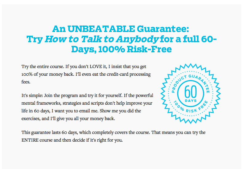
Ramit Sethi’s landing page for his course, “How to Talk to Anybody,” is packed with pain. Sethi is selling a course and it’s predicated on pain — the pain of embarrassment, missing out, being rejected, and feeling lonely. He features dozens of testimonials that drive this feeling further and further, making for a very effective landing page:

Essential Element 8: Something about Pleasure
Just as humans are pain-avoiding machines, we are also pleasure-seeking animals. Every human is motivated by the desire to gain pleasure, which can have a variety of forms.
- Your goal in the landing page is to show how pleasure is a by-product of having the product or service. So, for example, you are selling arthritis-relief medication. But you’re not just selling a pill. You’re selling freedom, relief, and joy. If you sell cross-training footwear, you’re not just selling something that goes on a customer’s foot. You’re selling respect, trendiness, security, vibrancy, and fulfillment. Each product can be presented in such a way that it brings emotional and psychological pleasure.
- Use emotional pleasure cues. Discover the ways in which your product meets an emotional need beyond its mere functional role. We all desire to be accepted, loved, appreciated, recognized, honored, compensated, admired, etc. What emotional craving can your product or service help to satisfy?
Mixpanel sells A/B testing services. Not all that emotionally powerful, huh? Think again. The landing page they use helps to inspire a sense of wonder and surprise. Humans have a psychological proclivity for surprise. It scratches an emotional itch. That’s exactly why this headline is perfect for speaking to the brain’s pleasure center.

Reputation.com helps users gain back their reputation. It’s easy to see their pleasure-added headline, subheadline, and CTA:

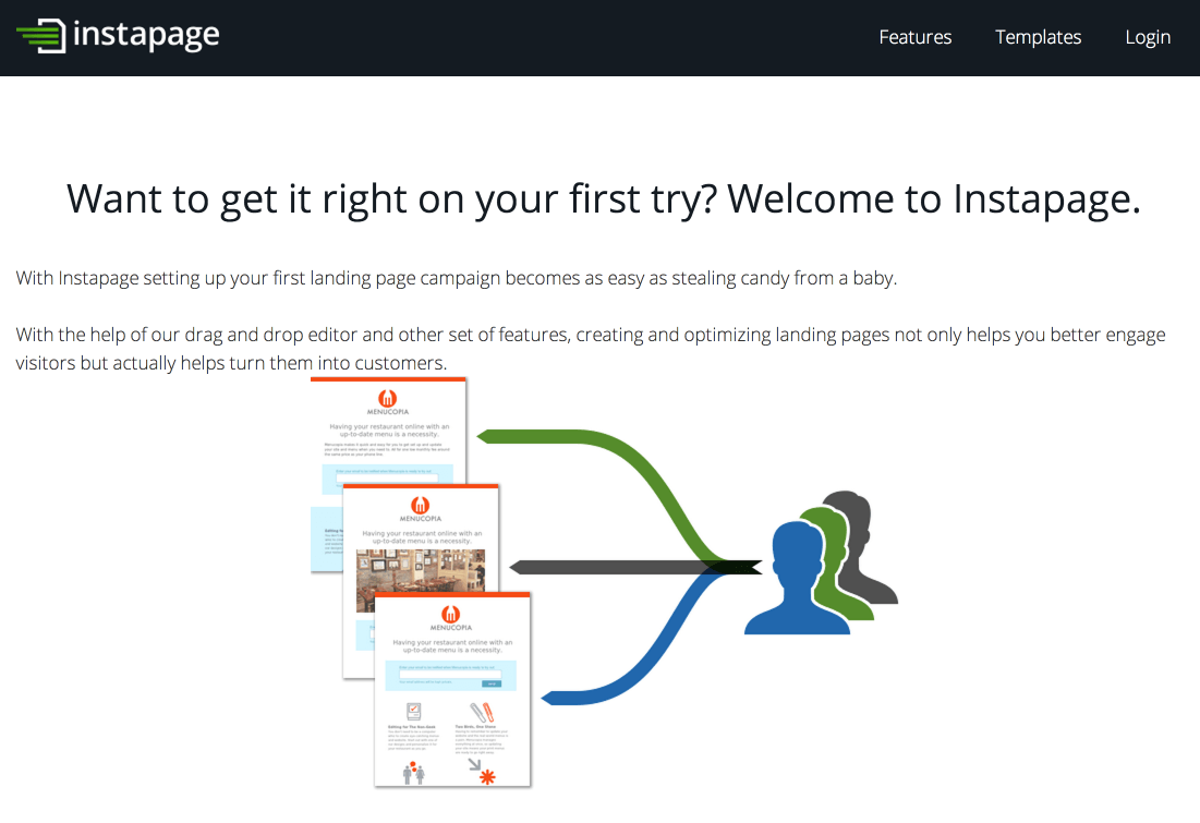
Instapage’s landing page presents the user with this question, “Want to get it right on your first try? Welcome to Instapage.” This desire to get things right on the first try resonates with an emotional need. We recognize that doing so will build our confidence, our reputation, and maybe our income.
Essential Element 9: Trustworthy Testimonials
A landing page’s testimonials are one of its most important trust signals. A user wants to know that they can trust the product or service. If they see a trustworthy testimonial, this goes a long way in cultivating the user’s trust.
- Use testimonials from real people. Celebrities and experts are great, but you don’t need testimonials from these people. Choose testimonials from people who are most relevant to your target audience.
- Make sure you use pictures. Pictures are the keystone of trust in testimonials. It’s important that every featured testimonial be accompanied by a photo of a real person.
- Testimonials should be specific. Glittering generalities don’t make great testimonies. The best testimonies are those that are backed by real numbers, real data, and specific applications.
TasksEveryDay, which provides offshore virtual assistant services, uses a rotating carousel of testimonials. Each featured testimonials has a picture, a name, a video, a specific geolocation, and a clear discussion on how the service benefited them.

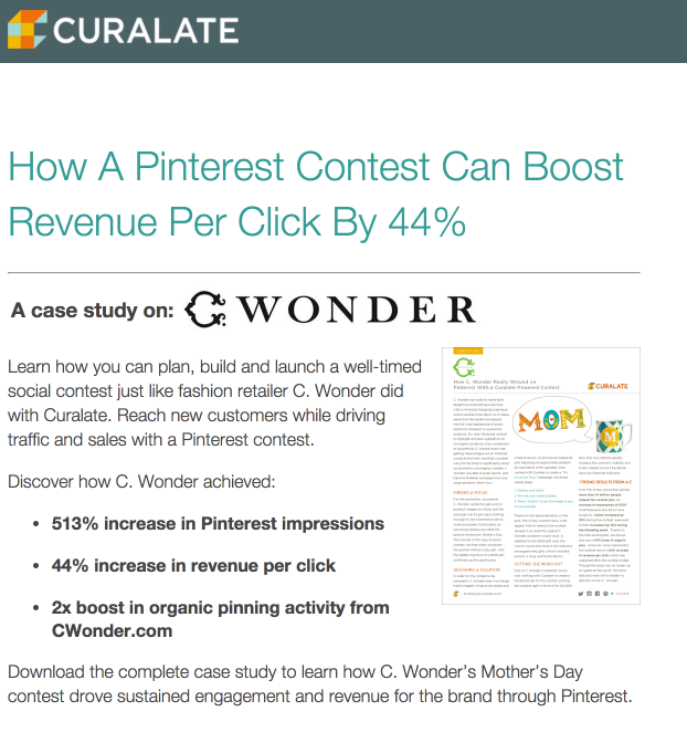
The testimonial on Curalate’s page uses three different detailed numbers:
These testimonials on Instapage also feature pictures, names (first and last), positions, and companies.

Essential Element 10: Methods of Contact
Are you legit? Then prove it.
Some of the most persuasive landing pages that I’ve visited have multiple methods of contacts — a phone number, a physical address, an email address, and a contact form. Some even have popups where a customer service representative asks me if they can be of help.
These go a long way to help strengthen my trust in the company, and to eliminate any friction in the conversion funnel.
- At the most basic level, provide some assurance that you are a real company. Usually, this involves a physical address and a phone number.
- Live chats featured in a popup can be helpful, but not a must-have. Using live chat is somewhat controversial. If you insist on using one, do your homework, and make sure you have some convincing reasons for keeping it there.
While researching this article, I chatted with one of the representatives from IwillTeachYouToBeRich. She was helpful and courteous, and answered my questions. Besides, I knew, as a customer, that the company was present and responsive. If I had any questions about signing up for the course, I knew I would be able to get answers:

The “Chat Here” box is always present, regardless of scroll depth, on FotoZap’s landing page:

A large contact form on the TasksEveryDay landing page made it easy to get in touch with the company with any questions or concerns.

SignNow, a service of Barracuda, has a landing page with an easy-to-use chat function.

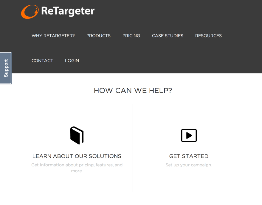
Retargeter has a simple landing page with an easy-to-use “support button” in the upper left.
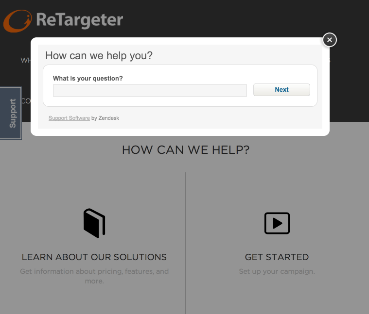
Clicking “support” brings up a lightbox chat form.
Essential Element 11: A Guarantee
Customers love guarantees. A guarantee, regardless of what it is or how it’s presented, can help people feel reassured while on your landing page. Simply the word itselfimproves the likelihood of a conversion.
- Guarantees can take many forms. Choose a type of guarantee that works for your business type, and state this guarantee on your landing page. There’s no need to delve into the legalities of it. Just say it. The point is that you have a guarantee, and the customer knows it.
- In the absence of any explicit product guarantee (e.g., satisfaction, money back, etc.), you can provide a different type of guarantee: e.g., “100% No Spam Guarantee.”
- Position your guarantee statement close to the CTA. This proximity will help the user 1) receive a final bit of assurance, and 2) be ready to convert.
Ramit Sethi gives his customers a killer guarantee and he goes into detail to explain how it works:
At the bottom of Help Scout’s landing page, they provide this reassurance. Although it doesn’t necessarily give an explicit guarantee, they do provide a level of comfort that’s similar to a guarantee. The award and shield icon are also reminiscent of trust badges, further enhancing this assurance.

Essential Element 12: Powerful Call to Action
The last position is for the most important element of all — the call to action. No element listed in this article is as important as your call to action. Here are a few CTA must-haves.
- Make it big. Generally speaking, the bigger the better.
- Make your copy compelling. The actual CTA copy is the most significant copy on your entire landing page. Don’t use the word “submit.” Instead use something explosive, exciting, and persuasive.
- Use a button. Users have been trained to expect the CTA to be a button. Do not attempt to force back years of expectation by using something other than a button. Stick with the tried and true. People know what to do when they see a button.
- Use a contrasting color. Your landing page, your company, your stylebook, and your designers all have certain colors that they like. Your landing page has a color scheme. Now, whatever color you use on your CTA, make it different. At the most basic level, your CTA needs to possess color. And, to make it stand out, that color needs to contrast from the other colors on the screen. Contrasting colors help to attract the eye, and compel the click.
The CTA for Help Scout is located directly underneath the testimonial section. This provides a seamless and logical flow, both from a design and cognitive perspective.

At the bottom of Mixpanel’s landing page is their CTA. It’s positioned brilliantly, and the copy on the button is perfect (“Try it for free.”) Instead of using a contrasting color on the button itself, the designers chose to use a contrasting color for the entire CTA section.

CTA positioning is important. Although the landing page featured below has some shortcomings, the positioning of the CTA underneath the image helps to draw user’s attention to it, thus enhancing the noticeability and clickability of the CTA.

Instapage has a great example of a high-contrast CTA button. Notice how this button is a contrasting red, which totally stands out from the grays, and blacks of its surroundings.

Monsoon’s CTA is exactly what a CTA should be — big, bold, well-written, and orange.
Look at the size of the CTA for Monetate:

Get Response goes for the big CTA, too.

Conclusion
A landing page is the place where all your efforts come to fruition. This is the place where customers click, people buy, and you make revenue.
Don’t screw it up.
You will create a powerful and high-converting landing page by implementing each of these 12 essentials. And once you’re done, do some A/B testing, and keep improving. The process of creating a landing page is never finished. You will always improve.
What do you consider to be some of the absolute essential elements of a high-converting landing page?
No comments:
Post a Comment